Our 6-step guide to creating a website strategy

Jayme Rey

S ifting through the digital noise to find a partner with a solid website strategy can be tedious. Many agencies are surface-level; they don’t align to your unique business goals, and they end up offering a one-size-fit’s all solution.

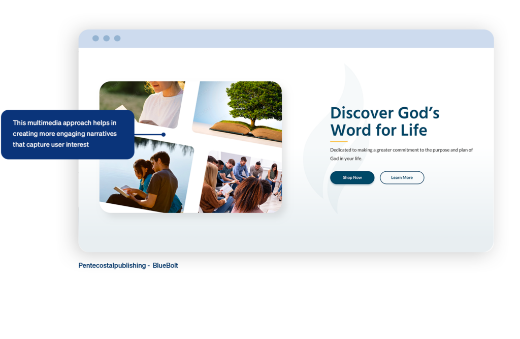
Here at BlueBolt, we begin with understanding who your users are and how to speak their language. From there, it’s about blending design, content, and functionality in a flow that drives engagement and tangible results. I’ve seen first-hand how a strategic approach can turn a site from just another online presence into a powerful business tool.

Here’s a breakdown of the key steps:

1: Define clear goals

Before starting any project, it’s important to have a clear understanding of your KPIs—or key performance indicators—they serve as the benchmarks for success and help guide your decisions as the project unfolds. Do you want to increase conversions, average time on page, or newsletter signups? BlueBolt takes down these KPIs in discovery and use them as the base of our strategy.

For example, if one of your KPIs is to increase average order value (AOV), we’d focus on strategies like upselling and cross-selling during the UX phase. This could include bundling products, personalized recommendations, and a progress bar for free shipping to encourage larger purchases. And that’s just one KPI—most companies have 4-5 key metrics in mind when starting a website overhaul. We’ll use metrics from Google Analytics to measure our success, and A/B test to continually iterate and improve after launch.

2: Analyze competitors

How do you find gaps in the market and know if you’re missing out on opportunities to improve? Looking at competitors is crucial, because that’s the natural path a user takes in the awareness phase. If you’re not pouncing on weaknesses of your competitors, then you’re missing out. In our audit, we look at competitors design aesthetics, user experience, and site structure to understand what resonates with their audience. Next, we evaluate the content they produce—blogs, videos, and other resources—to see how they engage users. Finally, note any features or functionalities they offer that could inspire differentiation or innovation in your own design.

3: Select the right tools

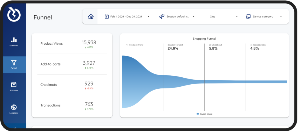
Data drives everything. We require real, actionable insights on how users are interacting with your website using GA4 and CrazyEgg in order to create a successful strategy.

GA4 is a must-have as it allows us to track key metrics and user engagement, as data-driven decisions are the backbone of our strategy and will lead to growth. We pull customized data from GA4 into Data Studio to make it easy for clients to see and understand their website data, helping them make informed decisions on their own as well.

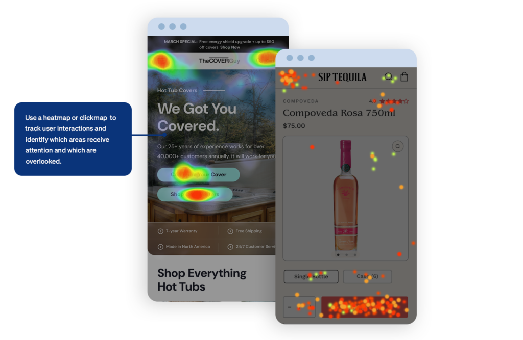
There are plenty of behavior analytics/website optimization tools out there, including Hotjar, Fullstory, Smartlook, Mouseflow, and Lucky Orange. I personally like Crazy Egg because of it’s easy to understand interface—heatmaps and scroll maps show us which areas of a page users focus on, where they click, and how far they scroll, giving us a clear picture of what’s working and what needs improvement. If client’s don’t have these tools we can rely solely on GA4, but these tools are like the icing on the cake.

Person analyzing data on laptop

As the cherry on top, we utilize tools like Hotjar for user feedback and SEMrush for SEO analysis, ensuring our strategies are data-driven and focused on driving growth for our clients.

When data leads the way, the results speak for themselves.

4: Prioritize User Experience

Drawing from the insights we gather through analytics, we focus on creating a seamless, intuitive web experience by simplifying navigation, providing clear paths to information, and reducing friction at every step of the user journey.

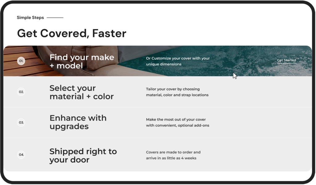
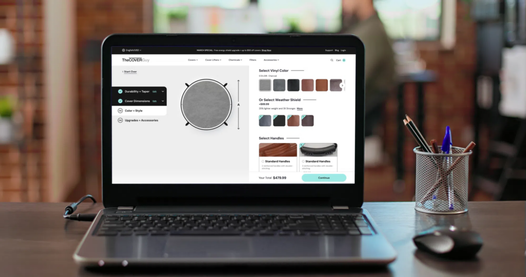
In our recent redesign for The Cover Guy, we addressed user pain points identified through analytics, which revealed that the majority of users abandoned the purchase process during the hot tub cover customization step. Our data also showed that users were spending too much time scrolling through a single-page configurator, which led to frustration and drop-offs. Based on this info, we redesigned the configurator into a step-by-step process with a clear progress bar. We simplified each step, breaking it into digestible sections which allows users to easily edit any section without losing their place. We also used data to feature the most popular color and accessory options at the top of each list, reducing decision fatigue.

This is just one example of many that exemplifies our intent to design with empathy, anticipate user needs, and support our decisions with data.

Laptop on a desk. The Cover Guy customization page is showing on the laptop.

5: Track Performance

In our digital strategy, keeping an eye on performance through KPIs is key to staying on track and hitting our goals. Your website is never “done”. It needs regular analysis to optimize and deliver measurable results. By monitoring metrics like traffic, engagement rate, conversion rates, and Average Order Value, we get a real-time pulse on how users are interacting with the site. I use Looker Studio reports to keep tabs on these insights, which help us spot trends as well as areas we can improve.

6: Collaborate Across Teams

Clear communication across design, development, and project management teams is a must. We use Confluence for documentation and Jira for tickets to make sure everyone is on the same page. It keeps things running smoothly, helps us avoid miscommunication, and allows for quick feedback and adjustments. When all teams collaborate effectively, we’re able to build a seamless user experience that meets both user needs and business objectives. Plus, this teamwork brings out more creative solutions and problem-solving along the way.

Conclusion

So, if you want to take your website to the next level with a strategic approach that combines data, design, and effective cross-team communication, reach out to us! We can help with a full site redesign, optimization of your existing site, or even a custom build. Get in touch with us today. What are you waiting for?

What are you waiting for?

Ecommerce Design: 5 Key UX Elements That Boost Conversions in 2025

Jayme Rey

I recently watched “Buy More”—a compelling documentary that unpacks the tricks brands use to keep their customers consuming online. The documentary, though subversive, got me thinking about the critical role that data science plays in every interaction on the web and how we leverage these insights for our clients.

In the last year, the importance of focusing on user experience (UX) has reached fever pitch in terms of driving conversions. With 2024 in our wake, I thought it apropos to write about five of the key UX elements that can significantly improve your online store’s performance in 2025.

In this article I’ll discuss content and commerce, CTA best practices, improving your conversion funnel, fast and frictionless checkout, and the importance of social proof. Let’s dive in.

Content and commerce

Content has always been king, but in 2025, AI will play a key role hyper-personalized content recommendations.

Picture this: you’re browsing a product detail page for a jacket.  AI already knows your browsing history, remembers you often gravitate towards blue tones, and has noticed you look at eco-friendly options. As you scroll, dynamic suggestions for other eco-friendly blue jackets are displayed, and at the end you’re fed blog posts about the latest trends in eco-friendly clothing. Before you checkout, a curated selection of accessories will display based on users who have similar browsing data. The more relevant the content, the more likely you are to make a purchase.  

Shopify and Optimizely are using AI to create hyper-personalized shopping experiences. Shopify focuses on automating product recommendations, email content, and search, while Optimizely enhances personalization with predictive analytics and AI-driven testing.

Great! That all sounds fantastic, but to reference Apple’s philosophy, if a something isn’t well-designed in terms of both form and function, it risks failing to connect with users. Enter: User Experience (UX).

The first step in any UX endeavor is to understand your users. It’s crucial to know how they interact with every page, every piece of content, every call-to-action.

“You’ve got to start with the customer experience and work backwards for the technology. You can’t start with the technology and try to figure out where you’re going to try to sell it.”

—Steve Jobs

If a client doesn’t have the ability to do extensive user testing and qualitative research (like screen recordings, card sorting or surveys), we can rely on good ‘ol best practice based on years of user research.

I’ve gathered a few examples based on our own experience at BlueBolt:

User’s don’t read—they scan. Redesigning a long paragraph into a single sentence with bullet points, or better yet, an animation, can go a long way in retaining users’ attention.

The Cover Guy - information and hover
  • In this example from our client The Cover Guy, the section is twofold—the user can gain information about the process while being delighted by the hover animation that encourages them to get started.
  • This is an “evergreen” rule that will continue through 2025 and beyond.

Users scan content left to right, and they also have a propensity to best remember the first and last items in a series, known as the Serial Position Effect.

NASS homepage hero
  • Knowing this, we designed NASS’s hero to focus first on the USP (unique selling proposition), and then invited them to scroll. The navigation to focus on the #1 item users are looking for (Professional Development), and last—search—as 69% of users these days these days go directly to search upon arrival.

Blending content with commerce is a key strategy for engaging users. People want to feel connected with a brand, feel themselves reflected in it, to feel a sense of community. Blog posts, educational content, storytelling, and social media are all meaningful ways of connecting with your users.

HockeyShot interest and products
  • In this example from our client HockeyShot, we implemented a ‘Training Academy’ on the website, allowing users to access articles from professional athletes, discover specific drills, skills, or programs that align with their interests, and foster a sense of community, while subtly integrating products within the content.

Calls-to-Action

Creating call-to-action buttons on a website may seem like a simple endeavor. Yet, you might be surprised by the amount of effort major brands like Walmart and Amazon invest in perfecting their calls to action. Big brands respond to and adjust their site experience to consumers depending on their unique behavior (new vs. returning user), preferences (green or light green?), and intent (I’m here to learn vs. here to buy). This may mean adding rule-based targeting with different messages on their CTAs based on unique customer journeys, like new vs. returning users. For example, a CTA button would read “Welcome Back! Continue Shopping” vs. “Get Started”.

Gone are the days where buttons are ambiguous (think “Learn More”) or stale (“Download Now”). “Download Now” may be direct, while “Get Your Free Guide Today” adds value by explicitly mentioning the benefit. Second, action words like “Get,” “Discover,” and “Start” often lead to higher engagement.

On top of that, I like to use a simple “squint test” to see if a CTA stands out from the other “noise” on the page. Just like it sounds, if you squint, is the eye naturally drawn to the CTA? If not, it’s time to adjust the visual hierarchy.

Sip Tequila call to action
  • In Sip Tequila, the CTA passes the squint test as the eye is naturally drawn to the CTA.
SOA call to action
  • In SOA, the CTAs are clear and descriptive.

Analyze the Funnel

During the discovery and UX phase, BlueBolt carefully examines the paths users take on the website. We analyze each segment and ask key questions like: What are the top landing pages on your site? What channels to they come from (e.g., organic search, paid ads, social media, email)? What elements do users interact with prior to purchase? Is mobile optimized? Does a user receive follow-up communication after checkout? This allows us to map out the user journey and spot any roadblocks that might be causing problems along the way.

Man looking at wall for web design

Here are some typical metrics to focus on:

  • Page load speed
  • Content relevance
  • Effective CTAs
  • Engagement rate
  • Click-through-rate
  • Average Order Value
Google Looker Studio Reports - Funnel
  • In BlueBolt’s Looker Studio Report, clients can visualize their data in a report customized to fit their unique requirements.

Fast and Frictionless Checkout

As Martin LeBlanc from Freepic puts it, “Good user experience is like a joke—if you have to explain it, it’s not very good.” This idea is particularly relevant when designing your checkout process.

In UX, BlueBolt focuses on streamlining the checkout steps, simplifying forms, and minimizing distractions, as a fast and frictionless checkout keeps users focused and reduces the likelihood of cart abandonment.

It’s no surprise that Amazon introduced one-click checkout—speed is everything. Returning customers don’t want to waste time re-entering their information. They expect a seamless, hassle-free experience, which leaves them with a positive impression of the brand.


“Perfection is achieved, not when there is nothing more to add, but when there is nothing left to take away.” 

—Antoine de Saint-Exupéry

The average checkout process on eCommerce sites spans 5.08 steps. Knowing this, BlueBolt focuses on clear instructions, multiple payment options, and progress indicators help users move quickly through the process without confusion.

NASS mobile design progress bar
  • Nass’s mobile design includes a beautiful progress bar to provide a clear visual indication of how far along the user is in the process.

Importance of Social Proof

We, the consumers, are naturally inclined to distrust company jargon and advertising, but we tend to trust the opinions of real users who have experienced the product firsthand. I know I do. It’s interesting that 99% of users look for reviews when they shop online as well. At BlueBolt, we’ve seen firsthand how essential social proof is in driving conversions and building trust. In our recent projects, we’ve made it a priority to incorporate customer reviews, ratings, and real-time notifications showing recent purchases. By doing this, we’re creating a sense of credibility and community around the brands we work with. It’s what the users want.

This strategy has been particularly effective in reducing hesitation and boosting conversions, especially in today’s market, where consumers are more discerning and trust-driven than ever.

star review ratings

As we head into 2025, it’s clear that creating a seamless and engaging user experience is no longer optional—it’s essential for driving conversions and building lasting customer relationships. By blending personalized content with commerce, perfecting call-to-actions, analyzing the user journey, streamlining checkout, and leveraging social proof, you can significantly boost your online store’s performance. At BlueBolt, we focus on these key UX elements to help our clients stay ahead of the game, and we’re excited to keep pushing the envelope next year.

Prioritizing Users: Why UX Matters More Than Design Opinions

Jayme Rey

A website primarily exists to serve its users, which is why focusing on User Experience (UX) rather than a design opinion is critical.

A well-designed website should be seamless and user-friendly while delivering the necessary information and functionalities to users. It’s important to put aside personal design decisions and focus on usability for everybody. Here’s why UX should take precedence in web design.

UX Focuses on User Needs

Users visit your site for a reason, and you have moments to capture their attention. Investing in UX optimization builds trust, strengthens brand recognition, and encourages users to return. Designers must deeply understand their audience—what they need, value, and their limitations.

At BlueBolt, we begin every project with a user-needs statement to ensure our team is aligned on design priorities. This approach helps us concentrate on solving problems rather than simply adding features. For instance, users don’t need a complex account page—they need a quick way to return an item. They don’t want an overly designed cart page—they just want to review their purchase and proceed confidently.

A common pitfall for designers and stakeholders is the false-consensus effect—the assumption that users think and behave like we do. This can lead to misguided design decisions. For example, a client might assume visitors will scroll through an entire homepage to find the contact form, but user behavior may otherwise show otherwise. A good UX designer anticipates these needs and builds intuitive paths to the most valuable content, guiding users effectively through the site.

By understanding what users seek, we create experiences that benefit both the audience and the business. This crucial insight is often revealed during our discovery and data analysis phases.

Prioritizing Users: Why UX Matters More Than Design Opinions

UX is a Sound Business Investment

Robert Pressman’s Software Engineering: A Practitioner’s Approach provides a strong justification for UX: “For every dollar spent to resolve a problem during product design, $10 will be spent on the same problem during development, and $100 or more after the product’s release.” This shows why companies should invest in UX early to prevent expensive fixes in the future.  

An optimal site fosters engagement, conversion, and retention—the three pillars directly affecting brand success.  

UX is Measurable

Things like user testing, heatmaps, and analytics allow us to understand how users behave, find the issues, and make evidence-based design decisions. Using a data-driven approach, we can craft sites with the best propensity for engagement and conversion.

Heat Map Example

In fact, according to research, businesses that are more focused on UX can reach conversion rates 400% better than those who are not. Our approach to assessing UX at BlueBolt focuses on a balance between qualitative and quantitative levels of assessment, including (but not limited to):

  • Surveys and Questionnaires: User feedback around satisfaction and usability.
  • Interviews and Focus Groups: Exploring user experiences and challenges.
  • Usability Testing: Watching real users use the product to identify friction.
  • Behavioral Analytics: Tracking engagement & conversion metrics with tools like Google Analytics.
  • Heatmaps and Click Tracking: Visualizing user interactions to optimize layout and content.
  • A/B Testing: Design versions for comparison and measuring performances.  

We continuously refine and enhance the user experience by measuring and analyzing these metrics.

UX is Inclusive

Good UX ensures all users can access a website, including people with disabilities, older users, and those from diverse backgrounds. This provides an inclusive experience for all users, which leads to a better user experience and necessary compliance with laws when adhering to standards such as the Web Content Accessibility Guidelines (WCAG).

Here are some ways to ensure design for inclusivity:

  • Accessibility Standards: Follow established accessibility guidelines and standards, such as the Web Content Accessibility Guidelines (WCAG). These guidelines provide specific recommendations for making digital content accessible to people with disabilities.
  • Keyboard Accessibility: Ensure that all interactive elements and functions on your website or application can be accessed using a keyboard alone. Many individuals with mobility or dexterity impairments rely on keyboards or alternative input devices instead of a mouse.
  • Color Contrast: Use sufficient color contrast between text and background elements to ensure readability for users with visual impairments. This is particularly important for individuals with color blindness or low vision.
  • Clear and Consistent Navigation: Design a clear and consistent navigation structure that helps users easily understand and navigate through your content. Use descriptive labels for navigation links and organize content logically.
  • Form Accessibility: Make forms accessible by including clear labels, using error messages that are easy to understand, and providing proper validation cues. This helps users with cognitive disabilities or screen reader users to complete forms accurately.

Inclusivity is an ongoing process, and it’s crucial for designers at BlueBolt to continually educate ourselves and adapt our design practices to better accommodate diverse user needs and disabilities.

In the end, putting UX first lets us create websites that are not just functional, but also beautiful, accessible, and intuitive. This means they are easy to access and navigate, providing an intuitive experience. By prioritizing the user, making informed decisions based on data, and designing digital experiences that cater to a broad audience, we truly deliver meaningful value.

Ready to Switch to Data Driven Design?

Crafting Modern Website Designs for Everyone

Jayme Rey

W e all have dreams of becoming designers because we're in awe of the fantastic work they do. Whether it's a captivating animation, a beautifully designed website, or a trendy app with all the latest features, we're inspired to start designing ourselves and create work equally impressive, if not better.

When we start, designing for design’s sake seems to be the end goal. Only when we grow and learn do we discover that design is about creatively solving problems. If we design for the end goal, it may be beautiful to look at, but it ultimately is soulless. It lacks the thoughtfulness and foresight to imbue a sense of meaning and create a usable final experience.

Staying current with the most recent visual design trends is essential for developing visually appealing and engaging websites. However, designing websites goes beyond aesthetics; we must ensure everyone can access and enjoy them. This article will explore some innovative visual design trends and discuss strategies for ensuring accessibility for all users.

Embracing Minimalism with a Splash of Color

Minimalism, a popular trend in online design, is characterized by straightforward layouts and intuitive user interfaces. These days, designers are using dynamic gradients and vivid hues to give websites personality and depth, resulting in online experiences that are both visually stunning and emotionally stirring.

FAQ page showing the use of gradients

In 2024, gradients and color transitions will make big returns, giving contemporary web design more depth and energy. Designers are attempting to produce visually pleasing results using gradients and different hues. A gradient’s color selection can evoke different emotions; aggressive gradients work well for websites related to fashion or entertainment, while gentle gradients provide a relaxing impact.

Accessibility Tip: When using color, ensure enough contrast between text and background colors to improve readability for users with visual impairments. Tools like the WebAIM Contrast Checker can help assess color combinations for optimal accessibility.

Dynamic and Engaging Animations

Animations continue to be used to create immersive and interactive user experiences. From subtle hover effects to full-screen transitions, animations can capture users’ attention and guide them through the website journey.

a web page showing the use on animations

Interactive effects create a sense of immersion and exploration, whether navigating through 3D environments or triggering animations with cursor movements. Tools like Three.js, Babylon.js, and A-Frame provide frameworks for seamlessly implementing interactive cursor movements.

Micro-interactions delight the user as they interact with elements, adding important feedback to give them a sense of confidence as they explore. For example, a check icon might appear next to a form field if the information added to that line matches the form’s requirements.

Accessibility Tip: Provide options to control or disable animations for users who may experience motion sickness or prefer reduced motion or control over strobing effects. Additionally, ensure that all essential content and functionality remain accessible even if animations are disabled.

Custom Illustrations and Graphics

Adopting distinctive images and personalized graphics is becoming more and more common as they support a clear company identity and improve the narrative element of websites. Whether hand-drawn illustrations or stylized icons, businesses can create a more immersive user experience that encourages visitors to explore further and convert into customers.

a home page calling out the use of custom graphics

In 2024, 3D icons are taking web design by storm, adding a new layer of depth and realism that captivates users and enhances the overall aesthetic. The use of 3D icons signals a modern and sophisticated design approach. They can make websites look more polished and cutting-edge, appealing to users who appreciate a sleek, contemporary aesthetic. This trend aligns well with the broader move towards more dynamic and interactive web experiences.

Spline, a versatile animation tool, empowers designers to create captivating animations and seamlessly integrate them into web projects.

Accessibility Tip: Accompany illustrations with descriptive alt text to provide context for screen reader users. Alt text should succinctly describe the purpose or content of the image without being overly verbose.

Inclusive Typography Choices

Typography plays a crucial role in setting the tone and enhancing readability on websites. Designers are experimenting with a diverse range of fonts, including variable fonts and custom typography, to create visually striking text elements.

Oversized, bold typefaces remain popular. They make strong visual statements and grab attention. This trend is often used in headers and hero sections to create a powerful impact.

a home page showing the use of oversized, bold fonts for readability

Accessibility Tip: Choose fonts that are legible and easy to read, especially in smaller sizes. Additionally, ensure sufficient line spacing and avoid excessive use of decorative fonts that may hinder readability for users with dyslexia or cognitive disabilities. Implement scalable text to allow users to adjust text size without breaking the layout, ensuring readability for users with visual impairments.

Seamless Integration of Multimedia

From background videos to interactive sliders, multimedia elements can enrich a website’s visual experience. When used thoughtfully, multimedia can evoke emotions and convey complex concepts more effectively than static imagery alone.

a page showing how to use multimedia

High-quality, full-screen videos are being used as backgrounds or as prominent elements in hero sections to grab attention and convey brand stories or key messages effectively. Interactive multimedia elements like hover effects, parallax scrolling, and 3D animations are enhancing user engagement and providing dynamic experiences that respond to user actions. Subtle animations and transitions, such as button hovers, loading indicators, and scroll-triggered animations, are used to guide users, provide feedback, and make the interface feel more alive and responsive.

Rich storytelling experiences and more captivating storylines are being produced by combining text, images, video, and audio.

Accessibility Tip: Provide alternative formats or transcripts for multimedia content, such as audio descriptions for videos or captions for audio files. This ensures all users, including those with auditory or visual impairments, can access the content.

Conclusion

Combine innovation, inclusion, and creativity to create cutting-edge website designs that appeal to a wide range of users. Use minimalism and vibrant colors, along with intriguing animations, to keep designs visually appealing and fresh.

Personalized images and graphics give your website a unique touch. Inclusive typographic choices ensure all users can access and read content, while multimedia integration enhances the overall user experience. By combining these elements, designers can build visually appealing, useful, and user-friendly websites that improve digital connections and engagement.

Let’s continue to push the boundaries of design and technology and strive to create a more inclusive and accessible online experience for all. Together, we can positively impact and set a new standard for website design that prioritizes our clients’ needs and challenges.

Need help with accessibility on your website?

10 Strategies to Improve Site Search and Conversion Rates

Chris Risner

D id you know that one of the fastest ways to build customer satisfaction and loyalty is to make your website easy to navigate? Consider these statistics… Up to 30% of visitors use a site search box when one is offered.

Also in studies, 15% of total visitors used site search, but these visitors accounted for 45% of all revenue. (Addsearch) Pretty compelling, right? However, while marketers contemplate adding search to websites to best serve customers, the hidden truth is that site search is the path to direct, real-time analytics, direct from the fingertips of your customers. While these statistics sadly won’t entirely replace the need for Google Analytics and making the switch to Google Analytics 4, intel coming from your site search data has no filter between you and your customer. In addition to all these great statistics, here are 10 ways to improve both site search and conversion rates:

Site Search and Conversions

Did you know that site search bar users convert at a rate five to six times higher than their counterparts not using a search engine? Inbox Insights found that customers using site search boxes are strongly signaling their intent to purchase or engage with content when they place a query in a search box.

Cutting Through the Noise with Site Search

10 Strategies to Improve Site Search and Conversion Rates

Site search can play an important role in your customers’ satisfaction. 30+% of customers use a site search (Addsearch) box to find products and content when one is offered. With customers continually being inundated with digital ads everywhere they look, offering your users that ability to cut through the noise quickly and precisely will lead to higher satisfaction and improved conversions. Offering site search as well as clear navigation on your website is the foundation of building loyalty among your customers.

Quickly Drill Down to the Right Content with Faceted Search

10 Strategies to Improve Site Search and Conversion Rates

It’s critical to offer faceted search. Filters and facets make it easier for a web user to narrow down what customers need. However, be careful not to provide too many search options, as it can also quickly get overwhelming. When done right, faceted search can help your customers quickly find their desired content and products.

Location Matters – Even with Site Search

Place your search box where a user can find it, according to standard UX site search and conventions. Really, this sounds like common sense, but it needs to be included based on what we’ve seen. Our team strongly suggests search boxes should at least 25 characters wide and put it in an obvious spot on the page, such as in a sticky top navigation bar or a list of faceted search options in the left rail. Over time, you can also A/B test the placement of the search box (experimentation blog) to see which placement users prefer.

Mobile Matters Too

10 Strategies to Improve Site Search and Conversion Rates
BlueBolt’s mobile design for CSBA

Don’t forget mobile. For companies who have a high level of mobile engagement, optimization is crucial for your website, as well as the search results page. To drive deep customer satisfaction, it’s important to go beyond just having a functional search box for mobile app users. Consider making changes that correspond with having a small screen space, such as limiting the number of facets or the character count of result descriptions.

Don’t Just Search Metadata

Search the actual content and products, not just metadata. Given that metadata is a very short summary of content and products, it stands to reason that only searching metadata would not provide a complete list of search results, especially content results. In a worst-case scenario, you may have the content on your website your customers are looking for, but the details may not be in the metadata, which would return zero results – and force your customer to go search for their needs among your competitors.

Site Search Engages Users

10 Strategies to Improve Site Search and Conversion Rates
BlueBolt’s design for CSBA

Engage users with search suggestions. After all, customers don’t know what they don’t know. Thanks to predictive text and natural language processing abilities, queries are able to be populated as customers begin typing. Furthermore, the more your customer engages with content on your site or performs searches, the more suggestion recommendations search engines like BravoSquared can make.

Site Search Growth

Create a strategy for how your site search will evolve with your website. Customers’ expectations are constantly evolving in this fast paced, digital world. Social media, blog posts, email campaigns and Google ads are transforming the marketing landscape, but also create a lot of noise. It’s important to create a roadmap of how your search solution capabilities can continually enhance the website user experience – and vice versa.

Real Time Analytics with Site Search

Leverage search activity in your content and ecommerce strategy. Your customers’ search engine queries are analytics showing you what customers want from your site. Analytics do not get any more direct or clear than this. Additionally, queries that return no results or results with low click-through rates is a great indicator of what is not working on your website – and a hint that you either need to revamp this information or abandon it altogether. It’s also possible that your digital offerings have gone stale – and your customers are eager for new content and products.

Optimize Based on Data Direct from Customers

Analyze and optimize continually.  Make it a habit to track the impact of every search function change on the total number of conversions. Overtime, this optimization will pay dividends.

Our BlueBolt team believes in the power of site search so much that we created our own search product, BravoSquared. Bravo combines the power of site search with artificial intelligence and machine learning to power relevant results the first time and every time. Bravo also excels at delivering smart product recommendations to help increase your ecommerce metrics. If you have questions about site search, we are always happy to answer them.

Schedule a Complimentary Site Search Consultation

The Role of Auto-Classification in Enterprise Site Search

Chris Risner

T he idea of an organized, digital search has come a long way since the Dewey Decimal System and your local library. Now, any search performed, such as one entered into Google or on any website, takes into account hundreds of data points (at least) in order to provide the absolute best results possible.

Boosting and improving website search results is a billion dollar industry for good reason, and many companies thrive off of providing these services. Enterprise search, while similar in nature to search engines, as it is used to catalog and provide requested results, has a different means of coming up with these results. Search parameters for internal searches within an organization are often determined by the Administrators (Marketing departments is most common, these days) and IT department, but recent developments within computer learning and AI makes it possible for the computer itself to perform auto-classifications within enterprise search. Auto-classification has the potential to revolutionize the way users within a network search for data. However, understanding the role machine learning plays in enterprise search is necessary before implementing any changes. 

What is Auto Classification?

Data classification is something that has plagued networks since computers have been used to search for content and files. Outside of knowing exact file names and locations, the need to classify information has proven both desirable and challenging at the same time. Up until recently, a file needed manual classification by having a person enter the metadata. Manually entering information about every file takes time and requires someone knowledgeable enough to perform the work. It also completely depends on the individual providing the information. The tags or categories one user might assign to a file or data record may vary completely from a second user, so manually classifying files has never been an exact science. It is also a time consuming exercise and becomes a full time job for even a small business, let alone one the size of an enterprise. This is where auto-classification comes in. 

Auto-classification can happen 2 different ways. One method is to have a separate application to crawl the files and database records, similar to that of a search engine. Another method is to have it as integrated to the search engine as part of the crawl. Once crawled, the application evaluates the contents of the file or database content and associates the information to existing tags or creates new tags and classifications regarding the content. In this way, metadata associated to the original data is created allowing for new ways of filtering and searching. Initially, the tags may prove generic and rather basic, depending on how the evaluation process is performed as well as the quality of the content itself. As users within a network begin to interact with files and other content, and choose certain data from enterprise search results, the application can learn from these selections. This is because auto-classification takes advantage of modern computerized and machine learning techniques (machine learning is also a portion of a larger concept called artificial intelligence or AI). 

The Role of Auto-Classification in Enterprise Site Search

Machine learning makes auto-classification superior to any possible manual input. With the ability to learn from performed searches, the enterprise search application not only can provide better tags for all users, but the software can (and will) learn the characteristics of individual users, altering search results specific for the end user through the use of personalization functionality (Opentext, 2017). 

The Benefits of Auto Classification

The benefits of auto-classification are both straight forward and tangible. With auto-classification, a user or admin no longer needs to take time out of the day to input tags and classify content. This in turn boosts productivity and, at the same time, provides a more unified and consistent tagging and classification process. It makes identifying files and data throughout the enterprise network easier, so the classification of one file in Tokyo is done in a similar manor to that in New York or Santiago. 

After auto classification up and running, the additional data from the auto classification allows administrators to implement filtering and faceting functionality on the search results. These filtering and faceting features allow the user to fine-tune and minimize the data in the search results, making it easier to find the information that they seek. In addition, including filters and facets for an enterprise search solution provides a more comprehensive and appealing customer experience by giving the visitor more control over the process.

The Role of Auto-Classification in Enterprise Site Search

Auto classification also has the capability of slashing enterprise search time by learning how a user performs searches and what kind of end search results they find most beneficial. In the same way, using machine learning to track and discover what each individual is doing in the system and personalizing the search results specifically for that user is a huge benefit in using auto classification.

The Downside to Auto Classification

Despite all the apparent benefits of auto-classification in enterprise search, there is a potentially devastating downside to the entire process. Machine learning and artificial intelligence remain in its infancy. Everything from Google’s search to digital assistants like Amazon’s Alexa all depend on this technology, learning on the fly and growing smarter by the moment. This sounds great when there is enough data available to make smart decisions, but in the early days of turning the system on, this may not be the case and the ability to provide meaningful classification may be limited until more data is indexed and evaluated and the additional machine learning can be processed. Because of this, the need would arise for an administration system that allows a person to visualize and evaluate what the machine learning is suggesting before it actually gets put into “production”. Providing as an intermediate step and approving the classification that is suggested by machine learning is likely going to be necessary until the system is intelligent enough and can be trusted to make its own decisions.

Overall, machine learning and auto classification may seem like a benefit, but there could come a time when an administrator may worry about a point in which a system becomes “too smart.” Enterprise search and auto classification is not likely to be an area where doomsday scenarios are going to occur, but it makes sense to evaluate this anyway. Technological professionals are not yet predicting the events of Terminator or other apocalyptic events where computers take over the world. Elon Musk remains at the forefront of modern technology. From the Tesla lineup of vehicles to building spacecrafts and investing in green technology, Mr. Musk has an in-depth understanding of computer technology. This includes artificial intelligence and computerized learning. In early July, 2017, Elon Musk stated Mark Zuckerberg, the creator and CEO of Facebook had a very limited understanding of AI and what it could potentially do (Tech Crunch, 2017). 

The Role of Auto-Classification in Enterprise Site Search

Musk proved to be more right than anyone would have guessed (especially so soon). Less than a week after calling out Mark Zuckerberg, Facebook had to shut down an AI bot system it had put into place because the bots had created a unique language and stopped responding to prompts from Facebook. While the episode did not harm anyone, it shows the potentially devastating impact artificial intelligence can have, if not properly kept in check (Gadgets, 2017).

Auto Classification, AI and the Kill Switch

There’s no denying how beneficial auto classification is to enterprise search. To provide the greatest benefit, auto-classification must rely on machine learning to tag and classify information as it crawls. Since this classification will be imprecise to start, a logic step is to add an administration process with the appropriate user experience to allow a person to monitor and approve and assist the automated process until the system can be trusted to categorize the content correctly on its own. In addition, this could potentially be used to control the system later if the AI gets out of hand.

The Role of Auto-Classification in Enterprise Site Search

In the long run however, as the recent Facebook incident has shown, it is vital to establish some sort of protocol to shut down the system, just in case the AI system progresses beyond the point of control. While all of this may sound entirely science fiction, it is quickly transforming into a reality. So for any enterprise looking into implementing this kind of technology into its enterprise search application, setting up necessary safeguards to take it off-line is a must. 

Implementing any kind of change into an enterprise network often takes a considerable amount of time. With that said, manually crawling, entering information, and tagging every single data file and piece of content within a network simply is not a feasible, nor a very smart, use of time or resource. Auto-classification has the ability to improve search results and the customer experience at the same time partially through search personalization, which in turn cuts search time and boosts employee productivity across the board. As the benefits of auto-classification greatly outweighs that of manual input, the organization must install safeguards and auto shut-off capabilities to ensure IT always, now and in the future, has complete control of the network. 

If you have questions about Site Search for your business, please either contact our BlueBolt team directly or learn more about BravoSquared by BlueBolt at this link.

What to Watch: The Web Design Trends Having an Impact in 2021

Jayme Rey

A fter a year unlike any other, marketers may have the desire to seek out new ideas and approaches to better communicate with their customers and create a sense of togetherness. I think it’s fair to say, everyone is ready for a breath of fresh air in 2021 and updating design approaches can help get us there.

Each new year offers us the chance to reflect, reevaluate and reset our brands to better resonate with customers. Afterall, there’s a lot that can happen within a year, and 2020 was no exception. Here are a few trends that will have an impact, all offering organizations the chance to update their brand’s aesthetic, earn customers’ attention, and drive greater results.

Increasing Brand Transparency

2020 challenged people to do their research and look at everyday things with a critical eye. It had us questioning what’s real, what matters, and what impact things have on society.

Instead of having the burden of uncovering the good, the bad and the ugly themselves, users are fond of brands that are transparent, lifting the veil on how the company operates. A company can do this by demonstrating a brand’s ethics, showing the user how exactly products are made, or how services are rendered. Creatively doing so within your brand will help you differentiate yourself among competitors in a resounding way.

What to Watch: The Web Design Trends Having an Impact in 2021
Credit: Panera Bread

UX Writing and Microcopy

After such a disruptive year, there is a yearning among consumers for reassurance and optimism, and in response, communication styles are changing in 2021. Brands are adopting more personal, less formal copy within their experiences that reads more like regular dialogue. Having a unique and more human tone to your copy will allow your users to feel connected, building closer relationships that support your brand’s individual style.

Credit Dollar Shave Club
Credit: Dollar Shave Club

Unique and Creative Product Photos

Life is messy and unpredictable. It was before 2020 and it always will be. Yet sometimes, designs tend to focus on perfection and society’s unrealistic expectations.

2021 will give brands the opportunity to stand out by incorporating surreal elements within their product photography to grab users’ valuable attention. By reflecting this cultural shift and rebelling against the norm, brands invite their users to spend time with their images, reflecting on meaning and vision. The goal is for potential consumers to use their imagination to make a connection with your brand, spend more time on your website and ultimately convert from browsers into buyers.

Gucci
Credit: Gucci

Softer Shadows, Layers and Overlapping Elements

Think about how much time you’ve spent staring at screens during the past year. It can take a toll on your senses. To break up the monotony, incorporating imagery with graphical elements, a trend from the last few years, will continue, with the addition of more subtle shadows to enhance depth. Elements that appear to float delight users and can make your website look slightly 3D.

Credit: Ghulaam Rasool

Additionally, as people have found themselves spending more and more time at home grappling with monumental and unfamiliar stressors, tastes in color have shifted to more muted hues that are proven to reduce anxiety and promote a sense of ease. Combining more natural and organic colors with design elements like shadows, layers, and overlapping elements help limit ambiguity and add richness to the brand.

Credit: Feals
Credit: Feals

Remember We Are All Human

I think one of the most important takeaways from 2020 is that the human condition is universal. It does not matter where you live, what you do, or who you are; we all experience the same feelings, hopes, dreams, and disappointments.

Design and “real” life are not mutually exclusive. We can take our own experiences not only as consumers ourselves, but as fellow human beings and use our experience and skills to help others navigate life both in the good times and bad. By keeping this in mind, we can better answer the needs of others and service them through experiences that bring comfort, optimism and unity to everyday things.

Wishing you all brighter days ahead – happy 2021!

Lessons Learned: How to Translate Highly Valuable In-store Experiences into Winning Digital Commerce Strategies

Jayme Rey

W e all know that online shopping has been on an upward trajectory for years, steadily eclipsing in-store shopping due to the advent of new technologies and evolving customer expectations. Now COVID-19 has accelerated even further changes in the industry and, in the midst of shutdowns and in-person restrictions, online shopping has quickly become the lifeblood of commerce.

We all know that online shopping has been on an upward trajectory for years, steadily eclipsing in-store shopping due to the advent of new technologies and evolving customer expectations. Now COVID-19 has accelerated even further changes in the industry and, in the midst of shutdowns and in-person restrictions, online shopping has quickly become the lifeblood of commerce.

Consider the following. According to Adobe Digital Economy Index 2020, there’s been:

  • 25% increase in US eCommerce daily sales
  • 20% increase in digital purchasing
  • 40% increase in average daily sales of computers and monitors

To answer the needs of your customers in this “new normal,” digital transformation and improved customer experiences have to be at the forefront, regardless of industry. And while these changes are usually fueled by technologies, often times answers to our online problems can be found within our brick and mortar stores.

So even though physical stores may be operating at a limited capacity or not at all right now, there is still the opportunity to take the tactile, human experience of shopping in a store and translate it online. But how? How can we ensure things like customer service, finding the right fit and tracking when and how users shop are not lost in an eCommerce environment?

Recently, I attended the virtual Retail Innovation Conference where there were discussions about this topic. The following are a few valuable takeaways I learned at the conference including what in-store retail has done right and how we can borrow those strategies to gain successes online.

Make it Easy to Find Help

When a customer is confused or can’t find what they need, help should be easy to find. In a physical store, customers oftentimes seek out an employee, only to have to wait in line at the checkout or customer service desk to ask a question.

The Vitamin Shoppe understood this pain point, and using customer feedback and data, they decided to completely overhaul their store design. First, they removed the physical barrier between the checkout counter, bringing their staff on the floor. This made their associates much more accessible to the customers. Second, they changed their POS system and started using iPads so that staff could search inventory and check customers out quickly and on the spot. The result has been higher conversions and better customer satisfaction.

The Vitamin Shop redesign
The Vitamin Shoppe’s new innovation store in Edgewater, New Jersey.

When a user is looking for help in an eCommerce store, we can take similar measures. It’s obvious that search needs to be easily accessible for users to assist themselves in product discovery, but the chat feature is another important solution…at least, in theory. A study by Baymard indicated that live chat can be highly disruptive to a user’s product finding journey. The study found that users prefer to seek out live chat themselves, rather than having chat served up in a popup or notification that’s not prompted by the user. So just like The Vitamin Shoppe, it’s important to have help easily accessible, but not have it get in the way of a customer converting.

Here’s the do’s and don’ts of implementing chat on your website:

Don’t

  • Include chat as a popup (especially on mobile)
  • Automatically expand a sticky chat window without a user prompt
  • Include sticky chat on mobile (as it overlaps important content)
Example of automatically expanded sticky chat window without a user prompt

Do:

  • Include chat in direct links within the help section of a site
  • Include a chat link in the header
  • Include a chat link in the footer, as many users will expect to find it there
  • Ensure live chat is properly staffed so users don’t have to wait
Example of live chat done right: include a link in the footer where users expect it

So yes – we can strive to replicate the same customer service online as we’d receive in a store, but it’s important to take measures to ensure we’re enhancing the user experience, not distracting from it. Using data and feedback, you can better understand how your customers prefer to receive their assistance and avoid negatively affecting their shopping experience.

Digitize Measurement to Reduce Returns

One of the biggest issues customers face when shopping online is trusting what’s presented digitally is what they’ll receive on their doorstep. For example, a pain point for clothing retailers online is ensuring the right fit. Sizes run differently based on brand, and it’s frustrating to have to order something only to have to figure out how to return it immediately after getting it. It’s annoying to the user, bad for the environment, and bad for your bottom line.

A possible solution? A self-service contactless body measuring app that enables a simple way to digitize measurement capture so that made-to-measure businesses can easily operate online. 3dlook helps you quickly and accurately measure your customers’ size and fit. Its software eliminates the guesswork of finding the right size by creating a 3D body model of a user’s body.

Lessons Learned: How to Translate Highly Valuable In-store Experiences into Winning Digital Commerce Strategies

The app is simple:

  1. Upload two photos
  2. Create your unique 3d Model
  3. Try on products and visualize how things will look on you
  4. Engage with your avatar in augmented reality

3dlook represents the next generation of apparel shopping by reimaging the in-store fitting room experience through a reliable digital solution and in turn, eliminating the guesswork, returns and frustration from the online buying process. Similar tactics and technologies can be used in other verticals, such as furniture and beauty, so that customers can feel more confident in their purchases and trust what they’re buying is what they’ll receive.

Engage with Your Users in Micro-Moments that Matter

Understanding your customers’ shopping behaviors and patterns is crucial to creating better shopping experiences, both online and in-store. Sometimes this data is easier to capture online, but it’s also important to understand for your in-store customers, which can then translate into online sales.

For example, The Vitamin Shoppe noticed two key things about their in-store customers: their shopping habits correlated directly with the peak hours of nearby gyms and when customers were in store shopping, they were usually on the go. Knowing this, they updated their store hours in conjunction with gym opening and closing times and also added fridges stocked with energy drinks and snacks near checkout.

Using The Vitamin Shoppe’s fridge as an analogy, online stores can include upsells, cross-sells, add-ons, and bundles on product detail pages and shopping carts to entice “on-the-go” users. This will increase your average transaction size and boost your customer lifetime value, ultimately leading to more sales.

In addition, Google Analytics can help you identify the locations of users with high conversion or transaction rates. You can use this information to target ads to your most profitable areas, like offering a discount for 25% off multiple items, or to less profitable areas by offering free samples or shipping with a purchase to get users to engage and convert.

Anagog is another great solution. Their ground-breaking EdgeAI technology can help you create accurate personalization based on your customers’ real-world daily journey. You can look at a customer’s daily timeline and identify the best times for user engagement.

Lessons Learned: How to Translate Highly Valuable In-store Experiences into Winning Digital Commerce Strategies

Again, this allows you to target ads based on user behavior and predict what your user may want and when before they even realize it. This kind of hyper-personalization increases the odds of an impulse-buy and will increase conversions and create customer loyalty.

Create a Beautiful Space

Whether you’re shopping online or off, aesthetics matter. The Vitamin Shoppe recently elevated their shopping experience by completely overhauling their interior design. The design features a warm palette with wood flooring and HGTV inspired fixtures like Edison bulb lighting, brass signage and leather trim. The design is simple, yet modern. They also included a new wayfinding system to streamline the shopping experience. The result? Once again, higher customer satisfaction and increased conversions. I mean, who wouldn’t want to shop here?

Lessons Learned: How to Translate Highly Valuable In-store Experiences into Winning Digital Commerce Strategies

Likewise, good web design creates meaningful first impressions. Your design’s main purpose should be to solve your user’s problems and boost your brand’s credibility. Studies show that first impressions are 94% design related, and can be the difference between making lasting impressions or losing users for good.

California School Board Association’s Legal Library design by BlueBolt

Using the example of The Vitamin Shoppe’s updated open concept, online design should: include whitespace strategically to create a buying progression, use less copy to cut down on visual noise, and apply modern design principles that users have begun to expect from top brands on the web.

Today, while more and more consumers want to buy online because it’s easy and safe, they also expect to have some of the same rewarding shopping experiences online as they would in-store. By focusing on customer service, identifying key micro-moments of user behavior, and implementing new technologies, you can stay ahead of your customer expectations, increasing conversions and building loyalty.

Customer Journey Mapping: Don’t Just Meet Your Customers’ Expectations, Exceed Them

Chris Risner

E Ever since the late 20th century, when access to the Internet became more widely available, technology has fueled democratization of information. Through websites, apps, phones, streaming services, media, and other advancements, the everyday consumer now has open access to more information than ever before!

A consumer can go online to read reviews, price shop, or decide to do business with you based on any number of other interactions that are readily available to them – whether they’re initiated by you or not. This has led to heightened customer expectations and the necessity of organizations, no matter what industry they’re in, to adopt a customer-centric focus in order to remain relevant.

Meeting Expectations = Satisfied Customers. Exceeding Expectations = Loyal Customers.

However, just meeting customer expectations is not enough. Having satisfactory customers is not enough. In order to be successful, companies must instead focus on delighting, connecting, and having more meaningful interactions with customers. The more cohesive and significant your interactions are, the more likely you are to generate loyal customers and repeat business.


customer journey mapping 1

Map Your Customer Journey

Just as you may use a map to guide yourself on a road trip, having a map of your customer journey can enable you to understand what route to take when interacting with customers and how to exceed their expectations. But remember, like a road trip, it’s not just about getting from Point A to Point B – there are a lot of other factors involved. You have to remember to look at the journey holistically – where can I stop to get gas, where will I spend the night, how much do I need for tolls? Similarly, you must think of your customer journey map realistically and realize the many touchpoints and interactions you have throughout a sale and beyond. While you may think you know your customer, only by shifting your perspective to an outside-in approach and stepping into your customers’ shoes will you really be able to understand their journey and deliver on it with more meaningful connections.

Where to Start:

Every company is different, but no matter what approach you take, mapping out your customer journey will be futile unless you first establish a goal. You need to know where you’re going before you start. Goals can include anything from generating more sales, launching new products, or upselling current customers. Once you have established this goal, you should focus on the following to get started with your Customer Journey Map:

Define Customer Personas

This first step can be overwhelming, especially if you have many different products or services that are targeted to a variety of customer types. However, understanding your customers through personas is crucial. Instead of worrying about all your different customer scenarios, first focus on a straightforward journey that can be used as a baseline for future maps. Think of who is most likely to spend time with and buy from your brand. Step into their role. What information do they need in order to buy, either now or later? What about their background may affect their purchasing decision? By defining personas, you can better design your processes to meet the customer where and how they want. And remember, don’t discount real life experiences when thinking about your customers; they’re humans too!

customer journey mapping 2

Gather Data from Across the Organization

Even if you don’t have the technology or tools to properly gather data to analyze your customer journey, you probably have more actionable insights at your fingertips than you think. Post-purchase surveys, Net Promoter Scores, in-person interactions, and digital marketing channels can all provide important insights into how your customers like to work with you. And while your role may focus on a particular business unit, other units within your organization may have access to different insights that you have never considered; it’s worth examining data available to you from other internal sources as well. Don’t worry if the data you have is not perfect or scientific at first – by implementing a journey map, you’ll start gathering more factual data throughout the process. The most important thing is to accept the data you do have as valuable and act on it appropriately.

Look at the Bigger Picture with Touchpoints

Touchpoints are any point of interaction between a brand or customer. So again, although you may have different business units across your organization, if you’re all working with the same customers, it’s important to look at customer interactions more wholly. You shouldn’t consider looking at the customer journey from just a channel level, but instead at a touch point level, and be consistent. If a customer loves going into your stores to interact with your knowledgeable and friendly sales associates but has a horrible experience with wait times when calling customer service, you could lose the interest of the customer because you’re not meeting their needs throughout their journey.

friends out shopping

Relationships Matter

In the end, having a great customer experience is dependent on having great relationships. These relationships emerge over time through meaningful and consistent interactions, that meet the customer needs at the right place and time. Successful companies use customer journey mapping to not only identify opportunities for growth, but also to address gaps in their customer relationships. Engaging customers consistently on a deeper level across all touchpoints, whether they be digital or in-person, establishes trust and reliability. Most importantly, businesses need to be just as committed to serving their customer needs as they are their own – only then will they truly be customer-centric.

If our team can help you increase engagement and conversions, please connect with us.

Why Growth-Driven Design is Critical to the User Experience

Chris Risner

G rowth-driven design (GDD) is the answer to the frustrations of such businesses. Simply put, GDD is the process through which websites are structured in a manner that optimizes traffic, focuses on the user experience, and results in the growth of the business.

Most dread when the time comes to redesign their website. They know that a fresh and more productive look is overdue, but they are horrified of the long and costly process that lies ahead of them. As such businesses weigh their options and continue to procrastinate redesigning their website, they repeatedly incur losses and slower growth due to the poor user experience on their current website.

Growth-driven design (GDD) is the answer to the frustrations of such businesses. Simply put, GDD is the process through which websites are structured in a manner that optimizes traffic, focuses on the user experience, and results in the growth of the business. With growth-driven design, businesses can prioritize on the implementation of the highest impact changes to their website, allowing them to avoid wasting time and resources on designing an entire website that does not lead to growth opportunities for the business.

Traditionally, businesses would redesign their entire website during a one-time period that was costly and lengthy to implement (anywhere from 3 months to 2 years). Such a strategy involved heavy investment in a project that contained high levels of risk and unpredictable results. The new website would be built almost entirely on assumptions, and with no strategy for continuous improvement.

How Growth-Driven Design impacts the user experience

The growth-driven design gives rise to a scalable and more adaptive website that is based on actual user engagement in order to provide opportunities for continuous improvement.

There are several critical components that define the internet users of today. These characteristics represent the pain-points of these users and how growth-driven design can be used to implement more engaging user experiences.

Short attention spans and Attractive visuals

With all the information that is out there today, the attention span of most internet users has been reduced to less than that of a gold fish. To put a number on it, most users have an attention span of less than 8 seconds before their minds wander to the next thing on the list. Therefore, the challenge for designers and web developers is to get their message across in the shortest time possible.

One of the best ways to do this is through creating attractive visuals. Hubspot has uncovered that a message along with a relevant image attracts 98% more views. Through growth-driven design, a business can begin to strategically tailor its message around strong visuals that align with the brand and the messaging technique. They can then use the user response and engagement to continuously improve this messaging design.

Adapting to Mobile

More internet users are relying on mobile devices to browse the internet. In fact, slightly over 52% of people worldwide are using smartphones and tablets (over desktops) as their main devices for surfing the web. Growth-driven design, therefore, aims at optimizing websites for easy viewing on mobile devices.

A best practice for growth-driven design is to develop a website for mobile before scaling up to larger screens. In this way, challenges with mobile viewing can be appropriately addressed before taking the next step. And because mobile devices may not have steady and reliable internet connections, the website is designed to be responsive even to poor environments of connectivity in order to minimally interrupt the user experience.

Attractive Content

One of the main concepts of growth-driven design involves engaging users with attractive and relevant content. A website that is structured around such layers of material draws traffic and immerses users into the overall experience. Creating powerful content requires deep audience engagement and user research in order to develop personas and to understand what the customers need.

With growth-driven design, businesses can develop and continuously improve their content based on actual user engagement. They can also optimize material for specific groups of users, based on responsiveness, quality, tone, and style. 

Easy Navigation

Today’s internet users are impatient. They desire smooth customer experiences that have minimal interruptions. If a business’s website is choppy and has many layers of sub-pages that make the overall browsing experience slow and disruptive, users will tend to engage less with the website. The message will also be lost upon the users.

Growth-driven design emphasizes a single page layouts, where parallax scrolling allows developers to fit more content onto a single page without disrupting the customer experience. With parallax scrolling, an illusion of depth is created on the page through a blend of background and foreground images.

As the user browses across content, each segment that the person highlights is shown in the front, while background content is slightly blurred out. Different sections of material are highlighted as the user navigates the page. The end result is an immersive user experience where customers are exposed to more content and attractive visuals.

Key Components of Growth Driven Design

Developing a Strategy

In line with tailoring growth-driven design efforts to suit the user experience, businesses need to develop a strategy that incorporates the goals of the business and the personas that the company wants to interact with. The first step is therefore to develop a “wish list” of what the company would want to achieve when users come to their site.  This can serve as the foundation for the website because the initial version will contain the must haves, i.e. the most important website components.

When developing a growth strategy, understanding the needs of customers will be key towards designing the user experience. Businesses should dive into the customer’s world and try to understand how they can solve the problems that users experience when navigating websites.

A business will be quickly on the path towards launching a new and improved website if they have a clear strategy. The decisions that should guide strategy include clear objectives that will reduce the need for constantly revising the website in its early stages, focus on customer needs and pain-points in order to develop an immersive user experience, and executable plans that turn wish lists into actionable ideas that can be implemented to achieve tangible results.

Designing the Launch Pad

In growth-driven design, a launch pad refers to the foundation upon which a business can build a website that is geared towards performance improvement and continuous growth. The launch pad is not the final product, but a solid foundation upon which users can begin to engage with the new business outlook. The company can begin to collect real user data that it can analyze and draw results from.

With a launch pad website, businesses can get a product up and running in 2-3 months. They can also save on costs by following a more targeted data-driven approach. This low-risk option is optimized for driving results because every decision that is made is done with the user experience in mind.

In addition, the budget for the new website can be optimized for continuous improvement, as opposed to taking the risk of building a finished product without considering the rapidly evolving needs of customers.

The launch pad website should contain the following key components:

  • Page plans: all the key pages are first laid out and the purpose and content for each page is outlined. Strategies for SEO are also put in place for each page.
  • Prototypes: After creating page plans and content outlines, prototypes for the website can be explored. These prototypes should echo the page outlines and desired content, making content easier to find.
  • Designing and Finishing: commonly referred to as the design sprint and the finish sprint, design involves implementing the chosen prototype and gathering feedback in order to develop the final design. The finish sprint involves coding, inserting links, metadata and testing the browser.
  • Emphasize on quality over speed: while the launch-pad is meant to be up and running in a short-amount of time, the process should not be rushed and quality should not be compromised.

Improving on the Design

After the launch-pad goes live, the business can start collecting data about the user experience. They can also identify critical actions that they can take in order to improve this experience and grow the business. Websites that are able to obtain maximum-performance and immersive user experiences are not built overnight. They have to be constantly tweaked according to the insights that data provides. These websites are both responsive and adaptive to the user experience, allowing them to attain high levels of productivity.

When seeking continuous-improvement, the secret lies in having key areas of focus where performance can be tracked and analyzed. Start with a focus metric that is important to improve the business. Ideas that highly impact the focus metric and lead to measurable results should be prioritized and implemented on a specified-timeline. In a nutshell, the basic-principle is to build, learn and adapt.

With having worked with multiple companies like HockeyShot, Rather Outdoors, Scoperta and many more, BlueBolt is uniquely positioned to help your company engage your users and fuel your growth. Please connect with us, so that we can best help you.

Why A/B Testing is Critical for Website Optimization

Chris Risner

W hen the multiple versions are compared, random, and statistical analysis is used to decide which version is more effective at achieving the conversion goals that are specified by the business.

As every business strives towards achieving increased conversion rates, various testing methods that are both objective and data driven typically are implemented in order to attain this goal. A/B testing is one of the methods used by businesses to test different versions of a website in order to determine which version performs better. It is a side-by-side comparison between 2 different webpages so as to draw insights that are provided by each version of the webpage.

How A/B Testing Works

A typical A/B test involves taking a webpage or app screen and modifying it to create a second version of the original page. The change that is carried out can involve either changing a headline or button or completely redesigning the page. Typically, marketers like to make small changes with each test to make sure that they understand what is causing the difference in behavior and can be confident in their decisions moving forward. If too many changes are made at the same time, it will confuse the results and it will be difficult to know what changes influenced the visitor. After the adequate modification is carried out, a portion (maybe as much as half, or more) of the website traffic is directed towards the original version of the page (this is the control page), and another percentage of the traffic is directed towards the new version of the page (the variant/variation).

Customer interactions with each version of the page are carefully tracked and the results are collected and analyzed using analytical tools. Many different performance indicators can be tracked, such as incoming traffic, click-through rates, time spent on specific webpages, among others. The data collected is then analyzed via statistical engines and other appropriate tools, after which results can be interpreted. The business can determine if the different experience had a net positive or negative effect.

Measuring Conversion Rates

The key performance indicator that is normally used for A/B testing is the conversion rate. The goal of any business is to get its prospects to engage more with its products and services. They aspire to gain more from their visitors than just visits and a few clicks here and there. Therefore, the rate at which website visitors can be converted from simply being visitors to something else is called the “conversion rate”. The webpage version that yields higher conversion rates is essentially the one that the business will choose to implement.

Your business will have different criteria for measuring conversion rates, depending on the nature of your business. eCommerce sites can use product sales as a means of measuring conversion rates, SaaS sites can use trial or subscription rates to their applications, and news and media sites can use click rates in ads or the number of paid subscriptions as a result of the website change.

Steps Involved in A/B Testing

Before a business dives into an A/B testing framework, it should clearly define its goals and develop a detailed and strategic plan that will make the testing process proceed objectively. A successful A/B testing process typically involves the following steps:

Problem Identification

Every business should have a reason for wanting to test a new version of a specific webpage. It could be that the current webpage design is unattractive, certain links are not being clicked on enough, or the redirect pages as a result of those clicks are not relevant to incoming traffic.

The business should specifically identify the problem that they want to address even before they begin to contemplate on possible solutions. 

Research and Brainstorming

The next step involves conducting research into the problem that is being experienced and brainstorming possible solutions. For example, if a certain webpage layout is not yielding the desired outcome, the business can carry out research into different designs that they can incorporate, and the likely results that these new designs are likely to yield.

Therefore, rather than a random process of trying out solutions, research allows the company to try out specific solutions that have been proven to work for other similar situations.

A Clearly Defined Hypothesis

A hypothesis is a possible explanation for why something occurs the way it does. In the case of A/B testing, a possible hypothesis statement can be “a webpage with more detailed product pictures yields higher purchase rates.” Another possible hypothesis could be “a contact us button on the top right corner leads to higher subscription rates by customers”. The hypothesis should be specific, clearly defined and easy to understand/measure.

Testing

Now it is time to launch the two different versions of the webpage. The version that incoming traffic experience can be varied based on time, customer behavior, or through the use of different URLs. As long as the testing process is truly randomized, accurate results can be collected.

Data Analysis and Reporting of Results

Once the desired threshold of data has been collected, it can be analyzed through statistical tools that are relevant and objective to the data. Tools that generate visual data such as graphs, pie charts and other distributions are the best to use so that decision makers can get a clear glance of the trends that are signified by the data.

Importance of A/B Testing for Website Optimization

Continuous Improvement

Continuous improvement is an important component of website optimization. In order for a company’s website to be effective at driving traffic and converting leads, it needs to slowly adapt to visitor behavior and the trends of the industry surrounding the business.

As small changes (driven by objective data) are implemented to specific components of webpages, the final product is a summation of all the individual changes that yields an improved and optimized website. This in turn leads to increased conversion rates for the business because the new webpage will attract more traffic.

Increased Conversion Rates

A/B testing is critical for website optimization because it leads to increased conversion rates. One of the main objectives of carrying out an A/B test is to determine which webpage version is more effective at converting traffic.

Therefore, the comparisons end up yielding results that show which particular webpage version drives more traffic than the other. The business can implement this more effective version and reap the fruits of increased conversion rates.

Better Understanding of Your Target Audience

A/B testing is a great way of gaining a better understanding of your target audience. As a business takes the time to identify the problems that it is currently facing with its website, as well as brainstorming possible solutions, the company ends up gaining a deeper knowledge of the needs that its customers desire.

In addition, by researching possible solutions to current website challenges, testing those solutions and obtaining objective results; the business can optimize its webpages by implementing changes that are backed by data and are guaranteed to yield results. This is a much more efficient process of solving problems that are facing the business.

Test Multiple Components of a Webpage

A/B testing allows a business to sequentially test all the components that are included on their webpages in order to determine the most effective option for each component. For example, a business can begin by testing headlines, text, links and images, after which it can proceed to test CTAs, testimonials and even text within the webpages.

Such a thorough and comprehensive testing model allows the business to optimize its webpages in a manner that attracts and converts traffic. Each component will have been tested in order to determine the most appropriate and effective design for the business.

If you need help increasing your conversions, please connect with us.

Landing Page Optimization – The Art and Science of Conversions

Chris Risner

I deally, all visitors convert to leads and eventually to customers, but on the Internet, as is the case with any brick and mortar store or facility, not all window shoppers end up making a purchase.

A corporate website typically serves as the one of the critical steps of an online marketing strategy and sales tool. After welcoming a customer to the digital presence (retailers would probably call this their digital storefront), potential clients have the ability to make a purchase, sign up for a service, engage with the brand by signing up for content, contacting sales directly for questions or determine they are not interested and leave. This is where landing pages come in. Landing pages can help reel in visitors at a fraction of the cost of a full-fledged website. Knowing how to take advantage of landing pages, how to properly optimize the stand alone page, and convert a visit into a lead is often what separates successful online businesses and those that fail. 

What is a Landing Page?

There are many varying definitions of a landing page floating around out there, so clearly outlining a landing page is necessary. Realistically, any page someone arrives on after clicking an external link can be referred to as a “landing page.” So in this sense, clicking on a product link and landing on the product’s page on a website can, technically, be referred to as a landing page. However, in terms of marketing and obtaining leads, the term landing page refers to something a bit more specific (HubSpot, 2010). 

In the world of marketing, a landing page is a page that helps a company obtain visitor information. This may be an email address, phone number, mailing address or other contact insights. For some companies, the main page on their website may serve as a landing page. However, for larger companies with an expansive marketing presence, a landing page often is a stand alone page, designed to work specifically within an advertising campaign. The stand alone page then directs visitors to the company website, product page or other designed site. It may also serve the purpose of only obtaining visitor information through a filled out form without any additional links (although taking advantage of generated backlinks can help the company’s main page with SEO purposes). 

The Importance of Targeted Landing Pages

Marketing should never revolve around a one-size-fits-all approach. Even when advertising a singular product or service, different demographics will identify with the product. Varying demographics have different core values and are likely attracted to the product for different reasons. Using the same marketing pitch for each undermines the entire process of connecting with these customers and results in a loss of potential leads. Instead, marketing should implement a level of variance. What works for one demographic may not work for another, which is perfectly fine. The marketing needs to mold to the needs of a consumer, not the other way around. This is also why landing page optimization begins and ends with customization (Leadpages Network, 2015). 

Creating a unique website for each demographic does not pertain well to success. It splits visitors and hinders search engine results. The company website should stand as a singular entity. However, landing pages should target each demographic and each unique marketing campaign. Landing pages, as a singular page with information tailored towards the recipient, is much easier to quickly manufacturer. The page’s main purpose is to then obtain lead generating information from the visitor, typically through the aid of a fill-in form (such as a request for an email account). The landing page then can direct traffic to the main website.

By meeting the needs of a marketing campaign, landing page optimization is easier to perform. The content on the page can be demographic geared. If visitors to the specific landing page are of retirement age, the imagery can focus on individuals just like them, while the information, text and other content can also target the demographic. A landing page should serve as an additional layer of personalization for a visitor. Once they provide the lead creating information, the visitor has demonstrated clear interest, so converting them into potential customers becomes that much easier (Sales Hub, 2016). 

Landing Page Optimization

Once identifying the need to create individualized landing pages for unique marketing campaigns and different demographics, it is possible to fully optimize the page. Landing page optimization is similar to that of optimizing any of a company’s marketing content, whether it is a social media post, an advertisement or a website in general. However, landing page optimization comes in two forms as a company not only needs to optimize the content placed on the page but also the individuals sent to the page. This is because there likely will be multiple landing pages up and running at the same time, so ensuring the right target audience makes it to the specified landing page is a must.

For proper landing page optimization, identifying a specific demographic to correlate with the page is necessary. If a page is to receive primarily retired aged individuals living in the Pacific Northwest of the United States of a higher income level, it needs to reflect this while another landing page receiving traffic from college aged individuals in the Southeastern United States should reflect this as well. This optimization remains no different from that of a marketing campaign. Ensuring traffic reaches the set landing pages is the next most important step (Hubspot, 2014). 

Directing Traffic to the Right Landing Page

A landing page is successful in obtaining contact information, which allows an increased conversion rate as long as the right visitors make it to the page (due to the highly optimized aspect of the landing page). Visitors arrive at a landing page through a designated link. The link can be attached to an email or through personalized marketing. This is where creating individualized email marketing lists is important. Email, pay-per-click and social media marketing should not be a one-size-fits-all approach. Each needs to be directed towards individual demographics. With the marketing directed at different key demographics and fit into different marketing campaigns, links for the specific landing pages can then be attached. As long as everything is corrected connected, the optimized marketing will send interested demographic towards an optimized landing page. The optimized landing page then has the ability to collect visitor information, which in turn helps increase the chance of converting traffic into an eventual sale (Forbes, 2016). 

Landing pages are valuable additions to any company’s online marketing approach. However, like any other part of advertising a company, it needs appropriate landing page optimization. By following through with these tips, it is possible to boost a landing page’s presence online, which in turn helps boost conversion rates and traffic sent to the corporate website itself. Converting visitors to leads and possibly customers further down the line is part art and part science due to the ever changing nature of the Internet. By continually editing and evolving an online marketing approach, it is possible to reach new potential customers while improving upon the advertising’s return on investment. 

If our team can help you drive conversions and increase ROI, please connect with us.